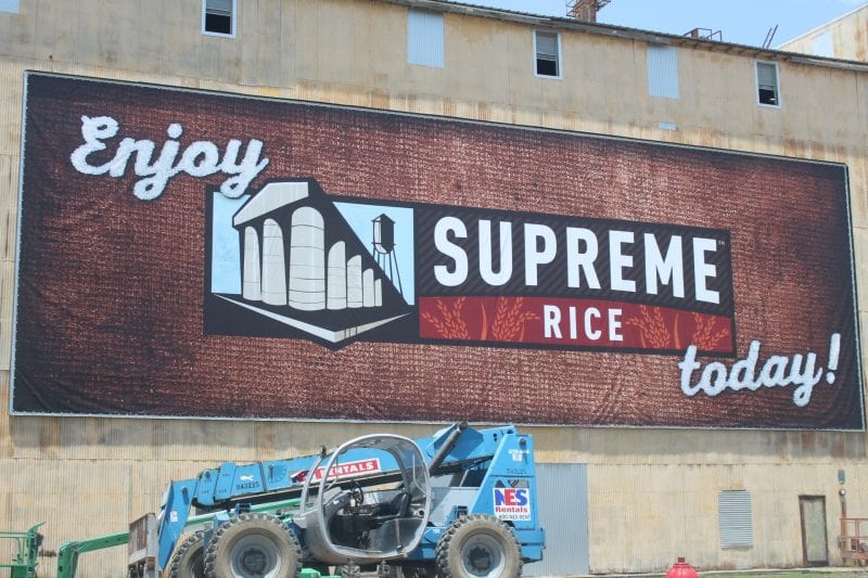
 For maximum visibility at any distance, best practice is to add one inch to letter height for every ten feet of viewing distance, so for a sign 35 feet away, you need 3.5-inch tall text to be effective.
- Group text and graphics logically, and separate them with spacing and layout to make keywords stand out for easy reading.
- Try to stick with a simple color scheme of just two or three colors, keeping in mind that high contrast color pairings, such as black on yellow or white on black, are more noticeable.
- Try to always use vector images for large-scale printing to ensure the image stays sharp and clear no matter how much you scale it.
- Find the right balance between graphics and text to attract attention without being cluttered or overwhelming.
Grabbing attention and increasing brand visibility are just a few of the benefits of large-scale visual signage, making them a great choice for promoting a business or special event. Designing these graphics requires a different set of parameters than traditional printing, and businesses often struggle to create large-scale graphics that offer the best ROI. At Pixus, we want to help you make the most of your marketing strategy with these five tips for designing large-scale visuals.
High Visibility
 Keep in mind the viewing distance when designing large-scale images. For letter height, add one inch for every ten feet of viewing distance. To hang a sign 35 feet from the average viewer, you need three and a half inch tall text to be effective. Most large signage will be viewed from far away and from up close, so it’s important to create a design that is visible and aesthetically pleasing from both distances. Using high-quality images and well-spaced text helps designs look great at any distance.
Once you a create a sign with a digital printing company that is easy to see, be sure to place it somewhere with maximum exposure. Illuminating the signage can ensure it’s highly visible both day and night.
Readability
Most people who view the sign won’t spend a lot of time reading it, so make the time they notice it count. Group text and graphics logically, and separate them with spacing and layout. Try using larger letters, additional colors or bold type styles to emphasize keywords.
Choosing the right font is another aspect of readability. Sans serif fonts are usually the best choice for readability. As you choose a font, keep the following in mind:
- Wide spacing between letters makes it harder to distinguish between words
- It’s harder to see individual letters when they are crowded together
- Making fonts too bold makes them look crowded
- Letters with very thin lines can disappear into the background
Contrasting Colors
 Make large-scale graphics stand out from the background with contrast and color. High contrast color pairings, such as black on yellow or white on black, make the sign more noticeable. In most cases, it’s best to stick with a simple color scheme of just two or three colors. Event posters and other signage that people stop to read are an exception; they typically benefit from a broader color scheme. Vibrant colors are good attention grabbers, but stick with ones that match or complement the colors of your existing brand.
If you’re designing an image on your computer, set the color mode to CMYK. Although RGB is typically the default setting and offers more color choices, most printers print using CMYK. Switching to CMYK during the design phase means you’ll get a more accurate color rendition when you send it to the digital printing company for the final print.
Vectors over Bitmaps
Choose vector images whenever possible for large-scale printing. Vector images have colors, lines and shapes defined by mathematical equations so the image stays sharp and clear no matter how much you scale it. Bitmap images are made of individual pixels with an assigned color and location so they look blocky or jagged when scaled too far. Sticking with vector images helps ensure the design looks just as good when a digital printing company creates a large-scale graphic as it does on your computer screen.
Balance
 The right balance helps a design grab attention without being cluttered. Too much text and too many graphics mean people won’t be able to absorb the message as they move past; too little makes it hard to attract attention. To help balance your design, try these tips:
- Limit the design to a few graphics and place them with care. Give each graphic plenty of space in the overall design so viewers don’t feel overloaded.
- Try stylized logos, line drawings or other simpler graphics that are easy to comprehend at a glance.
- Minimize text. Get the point across with a few short, simple sentences or a heading and subheading.
Focus on the design as a whole.
- Use negative space to your advantage.
Once you’ve designed a graphic using these five tips, ask for a small-scale test copy. This gives you the opportunity to check that the designs and fonts work together as a whole and that everything aligns properly.
Make large-scale graphics work for you by designing signage that’s effective. Our skilled and friendly team at Pixus can assist your business in creating effective large-scale graphics and all your other digital printing needs. Contact us here to learn more about our digital printing capabilities. We thank you for your business and look forward to hearing from you!